PROJECT TEAM
1 iOS scrum team (6 engineers in total)
2 product managers
PROJECT TEAM
1 iOS scrum team (6 engineers in total)
2 product managers
PROJECT TEAM
1 iOS scrum team (6 engineers in total)
2 product managers
PROJECT TEAM
1 iOS scrum team (6 engineers in total)
2 product managers
2014.7 - 2017.8

SAP SuccessFactors
Redesigning HR Approvals on Mobile
Timeline
April, 2020 - April, 2021
Role
Lead mobile designer
Impact
-
Accelerated customer adoption by delivering a delightful new experience.
-
Defined pattern that ensures scalability and consistency across SF and to a broader group of audiences at SAP.
The Background
HR approval process is lengthy and complicated.

HR approval processes are critical for organizations. Approvers often cannot get to an important approval in time because there isn't an easy way for them to perform the task anywhere and anytime. This results in a delay in hiring a person, getting a paycheck, or supporting an employee's move to the next level.
Solution Highlights
Simplifying approval processes for managers &
Optimizing workforce productivity for customer organization
SuccessFactors mobile wants to bring speed and agility to approvals. With the new capability, managers can grant approvals on the go to keep the processes going.
Surface approvals right from homepage
Managers express the need to be able to see pending approvals right from the homepage. In the refined experience, I surface the approvals with a clear call to action button to give managers quick access to their workflow tasks.
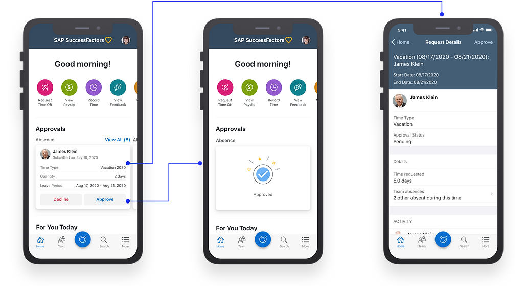
New and sustainable design pattern that allows quick decision to happen
The new approval card brings the most critical information to a manager. I designed the card as a common component that accommodates various approval use cases.

Bulk approval to better support managers needs
Managers often get multiple requests from their direct reports asking for time off or submitting their timesheets. Prior to the new design, managers must process requests one by one. In this project, I explored the bulk approval option to fulfill these unmet needs.

Challenge
Approvals are spread across different product areas, which makes alignment difficult.
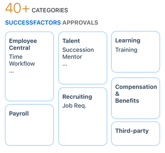
Successfactors has 40+ different approval categories owned by 8 different modules.
To make a unified and consistent experience, we need to work with each module to understand their use cases and get their support on technical details.

Conflicting requirements make alignment calls not effective
At an early stage of the project, we held alignment call with each module team to get their use cases. However, there's always conflicting needs. E.g. date and time are important to an absence request, but they might not be critical to a recognition reward request.
Design PRocess
Prioritization: choose timesheet as the key use case to start.


Approve timesheets of direct reports is the top task managers do on mobile devices.
Managers want to see approvals on their SuccessFactors Homepage.
In a mobile survey that we conducted with 26 managers in the U.S., approve timesheet of the direct report is one of the top to-dos on mobile.
HR admin and managers are two key personas of HR approvals. In multiple customer engagement workshops with both personas, managers express the need to see approvals from their mobile devices. In contrast, HR admins, who have approval as part of their daily job, prefer to do it in front of a computer and a more concentrated state of mind.
Ideating on approval representation
Since approval is a key feature that managers want to be able to see on their homepage, I explored several options with the goal to have approvals represented efficiently on the home.


Option 1: Show approvals at the categorical level on the homepage

Option 2: Show individual approvals as cards on the homepage
Pros
-
Works well when users have lots of different approval categories
-
Leverages native mobile gestures, enhance intuitiveness.
-
Easy access, action on the fly without navigating away.
-
Consistent representation with the rest of the homepage layout
Cons
-
Always needs to drill in to see details, 2 taps away from the homepage.
-
Not all approvals will be surfaced right away to users. Users must scroll horizontally to see other approval categories.
-
Important approvals might be hidden.
Outcome
From the unmoderated testing with managers, I decided to go with option 2: showing individual approvals with the following considerations:
2 -3 repeating approval categories is the 80% use case
One hesitation of adopting "card" is it can be intimidating to have a dozen different approval categories. Participants helped to clarify that they often 2 - 3 repeating categories.
What types of approvals do you receive often?
- Timesheet
- Time off requests
- Awards
Users like the clear call to action.
The card provides the actions on the fly, which receives well among participants with different technology literacy levels.
" Easy to use. I see that I can make decisions here (Approve, decline)." (P2)
"It's easy for me to focus on this task and act on it right from the homepage. Seems to be quick process. " (P5)
Ideating on bulk approval
Manager participants told us that they've repeating approval categories with multiple requests under each, which is an important UX area to invest to meet their needs. I shared this feedback with PMs and started to ideate how might we keep this bulk approval experience engaging and simple for users.

Option 1: List View

Option 2: Card View
Pros
-
List view provides the scan-ability
-
Leverages the swiping gestures
-
Consistent representation of cards with the approval card on homepage.
Cons
-
The information shown as list items are minimum; therefore users have to drill in to make a decision.
-
Card layout sacrifices information efficiency and density - especially for compact devices.
Outcome
The result from usability testing indicates option 1: list view is a better design choice; iPhone users feel it's natural to leverage the swipe gesture to act on a list item.
"As a manager I would trust my employees to provide the right info. All I need to do is just scan what they enter and approve. Done!" (P4)
"It reminds me a lot of the mail app. Kind of intuitive to know that I tap on "Select", I would expect some sort of bulk operations. (P2)
Iteration on Approval Card
Another major designer exercise for this is to explore the best representation of approval starting with the Timesheet use case.


" I am unsure if I am able to make a decision right here. It says new headcount requisition, but that's not enough for me to make a decision right away." (User testing)
Information Efficiency
" There is a lot going on this card. The visual hierarchy is not clear here to illustrate which one is the most important information you want me to grasp."
(SuccessFactors design peer)
Visual Hierarchy
" The layout of the supportive fields can be improved. Users have to do zig-zag readings. Try explore a way that lays out the info in a way that's easy for users to scan." (SF design team feedback)
Clear Layout that Supports Readability
Outcome
With a couple of rounds of visual explorations and additional support from the time module PM, I landed on a card design below.

How might I help the team to adopt more approval categories rapidly?
After having the timesheet card as an example, I started to think about reproducibility and scalability . I came up with the idea to make the approval card a common component with restrictions and guidelines around what to put on the card. This way, module PMs can use their best domain knowledge to decide on the important fields to their approval use case. Module designers just need to simply consume the component, plug the data in, and done!
This approach lessen the burden of module designers to take morning and late night calls. All we need is PM's business input and then API would do the magic for us.

Impact
"Seeing the new approval design already makes me excited. And then comes the bulk mode, wow, it's like a Christmas present to us."
We shared the approval preview with SuccessFactors key customers, and the feedback was very positive. 40 customers from 18 countries signed up for the beta program, and look forward to testing and adopting the new experience.
The cross-team collaboration path forward is promising and stress-free.
Streamlined Collaboration
By adopting the component, we successfully reduced the number of unnecessary cross-team alignment calls.
Pattern Growth
Card component was shared for a larger scale SAP initiative that includes approvals from SAP Ariba, Concur, Fieldglass.


