PROJECT TEAM
1 iOS scrum team (6 engineers in total)
2 product managers
PROJECT TEAM
1 iOS scrum team (6 engineers in total)
2 product managers
PROJECT TEAM
1 iOS scrum team (6 engineers in total)
2 product managers
PROJECT TEAM
1 iOS scrum team (6 engineers in total)
2 product managers
2014.7 - 2017.8

TRAILS
mental health services for students
Team
1 PM
2 UXD
1 UX intern
1 developer
UX Deliverables
User flows, personas, wireframes, prototypes, design systems,
Impact
More than 2800 school staff have attended training, and the statewide adoption has increased 56% since the launch of the new website.
The new homepage went live in Oct 2019. (Check out at www.trailstowellness.org)
Accessibility
Website Redesign
Psychoeducation
Background
Trailstowellness.org is a non-profit organization affiliated with Michigan Medicine. TRAILS mission is to provide evidence-based mental health programs to all students in schools across the state of Michigan.
How can we improve the site?
As the program grows, the team is continuously thinking of improving the site (the primary digital medium) for people to get to know TRAILS, access materials more efficiently, and keep up-to-date with the latest news and training opportunities about the organization.
Before the redesign: vetting through the old IA
The old site covers the manuals and resources school professionals need to deliver the training and gives users a thorough introduction to the program, the team, and the proof through testimonial why it works.


Defining the areas for improvements
-
Adding research information to prove the efficacy of the program.
-
The latest updates/news of the program
-
Information about how impactful TRAILS is at the state level
-
Accessibility assurance and improvements.
Who are target users?
I participated in the interviews with different stakeholders of TRAILS. As an interview observer, I came to understand the key user types of TRAILS better. As a team, we identified the opportunity to maximize the strengths of the TRAILS program through the new site design.

Planning for the new information architecture
Through the interview, I defined some important design opportunities for the new site.
To start addressing those design opportunities, I looked at the old sitemap to see what can be kept and what needs to be improved.
From the info architectural analysis, I found that there are several important missing pieces from the current site. Here are the following:
The ambiguity between Tools for help and help links
The current site offers two separate anchor points for tools and helpful links. Users are confused about where to find the right material for coaching.
Training and research updates are missing
There is no active presence of the training opportunities and TRAILS publication on the website, which are deemed to be important pieces for the program to grow.

To plan the new IA, here are the major considerations:
-
Bring news & updates, useful materials, program coverage info onto the homepage.
-
Introduce the training and research pages to give prospective school participants and school counselors easier access to the information they need.
-
Keep the tools for help section but rename it to resources to be more clear to coaches and school professionals.
-
Introduce the coaching page as part of the new certification program that TRAILS promote
Wireframe
Once the new site direction is clear, I start to think about the content structure of each page while remaining consistency.

How might we continue to strengthen TRAILS branding in the new site design?
TRAILS has warm orange as its primary color and calm blue as its secondary color. Those visual elements are used across TRAILS website, external/internal communications, as well as the training material designs.
With the goal to further strengthen the TRAILS program image and keep a consistent look and feel to our target users, I collected the key visual ingredients, which later evolved into a design system in the later hi-fidelity iteration.

Design Iteration
Material Info Structure Layout
Manuals and Resources, the key part for TRAILS deliverable, are the main focus for usability throughout the new site design. I interviewed coaches and did card sorting activities with them to understand their mental model when looking for resources.
We found that it was difficult for them to land on the right material in the old site because of a few information gaps:
-
Documents are scattered around and not connected. (Some are under TRAILS Materials, External resources, and videos are under helpful links...)
-
When looking for resources, coaches start with a specific grade level in mind. The current site does not offer such an opportunity.

As part of the new design, I rearranged the materials taking users' mental model into consideration and connected all the resources all together into its relevant topics

Accessibility Enhancements
Material Card
Previously, users need to hover on each item in order to see the download action, which is not accessibility-friendly. In this iteration, I prioritized to improve this experience.
2016

Now

Page Banner
To bring vibrance to the page, I decided to revisit the heading and image combination. The team really liked the title blending in with the text as part of the 2016 design. Therefore, our design exploration started on the basis of that idea.

Iteration 1
Increased the font weight and added the breadcrumb. The design is well received. However, I found a problem when trying to apply the same styling on another page - Coach.


Iteration 3
Tried shadow and other text stylings...

Iteration 2
I tried different breadcrumb colors to increase the contrast of the lower part of the “g.” Didn't work well visually and not sustainable.

Final choice
This layout not only solves accessibility struggles, but it also performed perfectly with users during our usability testing.
.png)
Final Design
Homepage
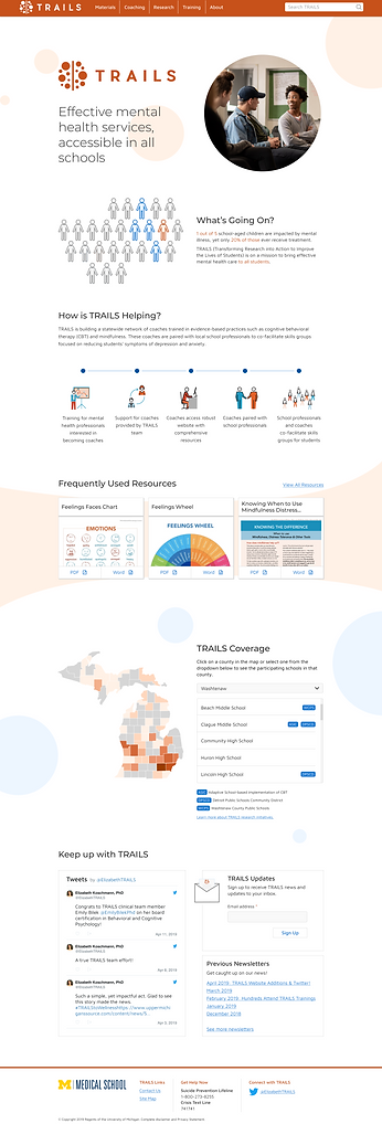
Nav Bar
Blending in the TRAILS dots as a visual enhancement.
Explaining how TRAILS works in an accessible infographic.
Providing 3 frequent used resources for users reference
Explaining TRAILS Coverage using Michiganer's favorite way - the hand! :)
Twitter updates and newsletter
Footer
Please visit trailstowellness.org to see the complete implemented website redesign work. Below is a snippet of the material section redesign I mentioned earlier in the design iteration section.
Looking for a manual or a resource
Evolving the design system
Desktop
Responsive Mobile
.png)
.png)
Lesson Learned
A good design should add visual flavor without sacrificing consistency and scalability.
In product development, we often get in a situation to choose between a better-looking design vs. a usable and functional design. As designers who create beautiful designs, it's easy to get emotionally attached to it and feel it a pity that we have to abandon the idea. However, as the system/site scales up, it's more important to think from the consistency perspective rather than make one feature stands out with the sacrifice of the usability portion of it. In addition, keeping accessibility in mind whenever I proceed with a design is very valuable learning from this project.
A redesign does not need to change everything.
It's easier for designers to look at the "redesign" project as a chance to change everything. However, the "old" design does not necessarily mean there's no value in it and everything needs to be changed completely. I learned through this project to start from heuristic evaluation and interviews with users to get to know their pain points of the old site is the key to "redesign". Every redesign is an opportunity to close those gaps and this is a mindset every designer should embrace.
Remote work can be efficient with clear expectation and frequent check-in.
Though all of the UX colleagues meet on a weekly basis in the office, I still view this as a semi-remote project since all engineers are not based in Michigan and the bad weather in winter always discourages people from driving 2 hours to the office. :) Despite all the difficulties you could imaging with remote work, we managed to deliver what's promised on time. The key to success attributes to the team's careful planning, frequent check-in, and clear expectation. Of course, tools like Figma helped to make remote work more efficient too!


