PROJECT TEAM
1 iOS scrum team (6 engineers in total)
2 product managers
PROJECT TEAM
1 iOS scrum team (6 engineers in total)
2 product managers
PROJECT TEAM
1 iOS scrum team (6 engineers in total)
2 product managers
PROJECT TEAM
1 iOS scrum team (6 engineers in total)
2 product managers
2014.7 - 2017.8
Amusee
your best amusement park assistant
.png)
Survey
Comparative Analysis
Amusement Park
Personalization
Rapid Prototyping
Project Brief
Role
UX Researcher and Designer
Project Length
12 weeks (September 2018 - December 2018)
Tools and Method
Survey, Guerrilla Testing, Stakeholder map, Storyboard
Adobe XD, FramerX, React
Visiting amusement parks is one of the most fun and relaxing activities. To maximize the time spent in amusement parks, people often plan things ahead. However, weather situations, fast pass, feeling of companions, or other situational factors require us to make decisions onsite in the park.
This is the motivation behind Amusee, and we hope to use our UX skills to create a personalized in-park helper for visitors to facilitate their decision making process so that they can have a pleasant time

💁♀️Fun Fact
Walt Disney World Resort announced shortly after I did this project that they are introducing a revolutionary app "Disney Genie" that shares many fundamental design similarities with Amusee!
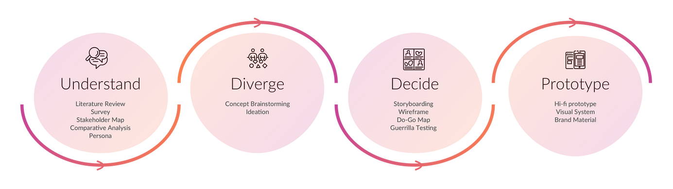
Design Process
Solution Overview
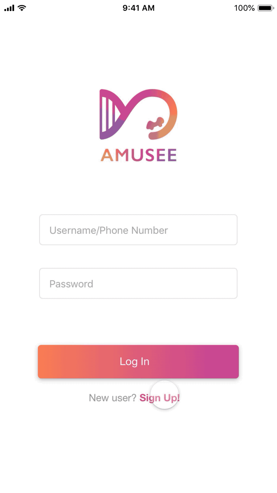
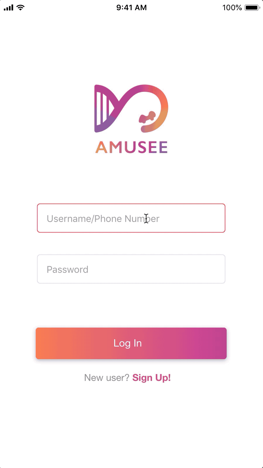
1. Sign up: understanding the user
Mary decides to sign up for Amusee. She specifies her information including age, gender, personality, and the preferred ride types.

2. Log in: understanding the current visit
This time, Mary goes to Disneyland LA with her friend. She logs in to the app and is asked to provide the information of the companion.
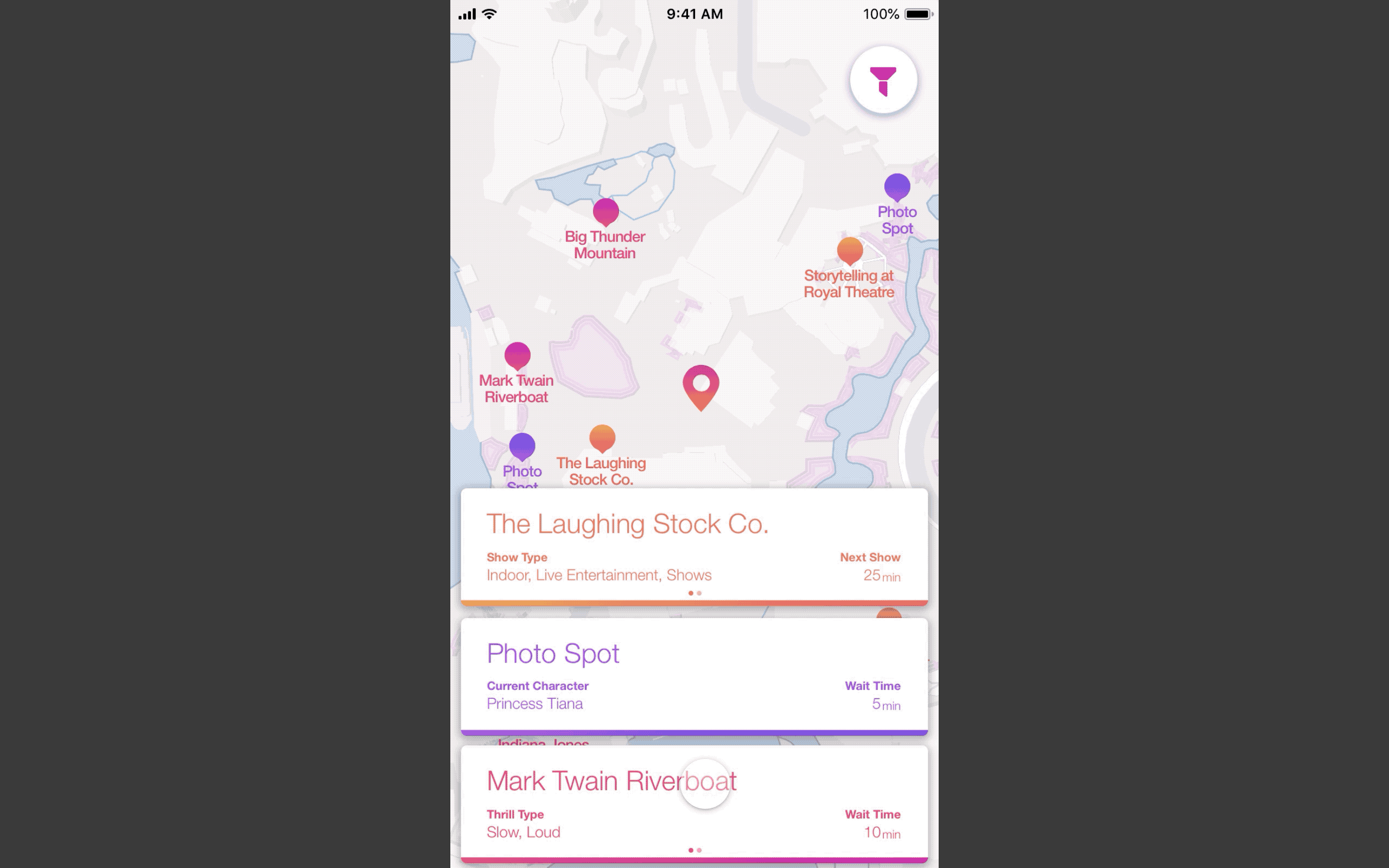
3. Nearby Attractions
Mary wonders which ride she takes the next. She opens the app, sees a list of attractions near her. Each attraction shows attributes including wait time, attraction type, the distance that are useful for her to compare and decide by skimming.
4. View attraction details
Mary wants to know more about the Mad Tea Party. She taps on the banner and gets more concrete information about the ride as well as personalized reviews.
Ride details
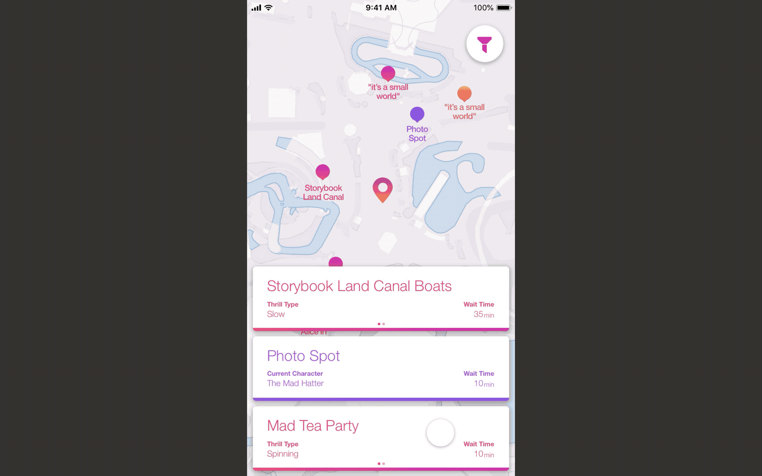
Show details

Understand
Literature Review
Amusement parks, including fairgrounds and theme parks, have been an area to drive the development of entertainment technologies. HCI communities have looked into how advancing technology can help to engage park visitors. Efforts have been made to improve ride experience, especially dark rides, through integrated technology.
However, less attention has been made to focus on visitors' perspective. Rennick-Egglestone et al. looked a bit further into how to personalize visitor’s experience through a proof-of-concept that utilizes the “Big Five” personality inventory and the “Sensation Seeking Scale” as the psychometric profiling to categorize visitors further and offer recommendations to them.
"A personalized tour taking account of visitors’ preferences and various constraints acts as an indispensable part of a pleasant park experience. The personalization aspect of the experience relies on appropriate decisions."
(Rennick-Egglestone, 2011)
Survey I: Explore the design space & define the target population
To further understand our target population and define our scope, we launched our first survey.
36 responses
Gender
69% Female, 31% Male
Age
33% 26 - 35; 31% 18 - 25; 28% 36 - 45
Frequency of Visits
56% 1 - 4
18% 10 or more
18% 0
8% 5 - 9
Factors for an ideal visit
62.2% Friendly environment
56.8% Acceptable wait time
43.2% Attractive rides
Purpose of visit
76.9% Spend time with family and friends
74.4% Seek for thrill and excitement
66.7% Enjoy the cheerful atmosphere
Findings
1. Making decisions during the park visit is still hard with the assistive tools they have.
50% of the respondents reported that "making decisions were still hard even with plans at hand".
2. Companions differ among age groups & gender. Some representative data is shown below.

Millennials
82% go with friends

Male
80% go with spouse

Generation X
70% go with younger family members
Design Space
To create an effective tool that provides users with customized attraction information that ultimately contributes to an efficient in-park decision.
Persona
We visualize and consolidate the survey analysis by creating three personas that best represent our target audience. (Click on each persona to view more details)


Comparative Analysis
To understand what the market has offered as well as the solutions that have incorporated the needs our users want, we started a comprehensive comparative analysis of the problem space.

Survey II: Understand target users' in-park behaviors
From survey 1, we were able to define our target audience, their high-level needs, and see how the current solutions or technology, either related to amusement parks or not, have helped to address those needs. We decided to run a second survey to understand our target users' current in-park planning behaviors and explore the unaddressed needs by the current solutions they use during the visit.
89 responses
Gender
69% Female, 31% Male
Age
27% 26 - 35; 24% 18 - 25; 22% 36 - 45
Frequency of Visits
49% 1 - 4
29% 10 or more
11% 5 - 9
10% 0
Preplanning Behavior
51 % brief planning
36 % detailed planning
13 % do not plan at all
Occasional Situations
92% of respondents experienced at least once
Knowledge of Park
7.9 out of 10 on average
Findings
1. Mobility Matters
Fact: 58% of respondents use park official apps, and 44% of respondents use physical handouts.
2. Current location is always the place where people start next step planning.
Fact: 44% of respondents use in-park signs and indicators for planning assistance.
3. Factors users care about for ride and shows are the following:
-
Wait time
-
Level of thrill
-
Ride type
-
Current fastpass availability
-
Operating hours
-
Wait time
-
Current seat availability
-
Potential conflicts with the next step
-
Storyline
-
Characters/Performers
Diverge
Based on our research findings, we brainstormed different product concepts.


Interactive Installment near rides
VR app with Cardboard
Mobile app
Smart wearable
Autonomous scooter
Entrance Kiosk
Diverge
Based on our research findings, we brainstormed different product concepts that fulfill our design goal.
Interactive Installment near rides
VR app with Cardboard
Mobile app
Smart wearable
Autonomous scooter
Entrance Kiosk
Decide
We evaluated our ideas from 3 perspectives: feasibility, cost, creativity.
From there, we decided to choose mobile as the medium for our solution and created storyboard with different scenarios around that solution.
Storyboard


Key Features

Getting to know users and their current visitors
Through the initial signing up phase, users specify their ride preferences, personality. When they visit the amusement park, they are asked to provide their location and information about companions for getting personalized and suitable information later.
Current park location as the starting point
Users can explore the attractions around them and compare the attractions to make decisions when they first enter the app.

Attraction information in a digestible way
When users click on the banner, they can view detailed and visualized information about the attractions as well as the reviews from others with similar attributes.
Wireframe, testing, and iteration!

Park Map
Reduce mental workload on users
Breakdown
Percentage is not clear to users
Popularity by Age
Percentage is confusing to users. Is it 90% of 50 or 90% of 500?
Onboarding
Progress bar added to give users more status info.


Weather Influence
Consider more cases rather than design only for a specific one.

Prototype
We gradually gained confidence about the overarching feature designs through usability testing and started to work on the visual systems and hi-fidelity mockups.
Visual System

LOGO
COLOR VIBRANT

Presentation
Reflection
If given a chance, what would we do differently?
Conduct a deeper analysis on survey data
We had rich data from Survey 1, but we didn't conduct a thorough analysis on it and was unclear about the direction of the project because of that. We had a retrospective meeting and analyzed our situation and found out that we actually didn't fully use the data that are already there to back up our design rationale.
Be less biased by design decisions
When we showed our wireframes to users for testing, we were surprised that certain features, for example, the use of percentage, were actually confusing to them.
Next step
More rounds of usability testing with different user groups.
Plan an ethnographic trip to amusement parks and pay close attention to the details of the rides.
Bring more attention to marginalized groups and make the design more universal and thoughtful for all groups!
Start the secondary research on pre-planning behavior for users.

