PROJECT TEAM
1 iOS scrum team (6 engineers in total)
2 product managers
PROJECT TEAM
1 iOS scrum team (6 engineers in total)
2 product managers
PROJECT TEAM
1 iOS scrum team (6 engineers in total)
2 product managers
PROJECT TEAM
1 iOS scrum team (6 engineers in total)
2 product managers
2014.7 - 2017.8

SAP SuccessFactors
Homepage Reimagined
Timeline
2019.12 - 2020. 5
UX deliverables
UX strategy, user flows, motion design, wireframes, hi-fidelity design
Role
Lead mobile designer
Key results
The new experience first launched in May 2020.
App store rating 4.3
The challenge
How might we create a starting experience that helps employees have a successful day?
SuccessFactors is undergoing the transition from Human Capital Management (HCM) to Human Experience Management (HXM). The focus of the transition highlights the HR shifts from supporting HR-related processes to delivering experience around what employees need to do and be at their best in the workplace.
Homepage, the starting experience for employees, is a critical part of this transition.

The solution
An individualized starting page that helps employees of all kinds.
After 12 months of effort, we designed and shipped this new starting page experience that works for both individual contributors and managers. We call the project "homepage" because this is a term that our customers most familiar with. It provides quick access to tasks users frequently do, reminds users of completing the tasks that are urgent and important, supports users' career growth by offering recommendations and opportunities, and brings users joy with meaningful celebratory moments.

Design PRocess
1. Understand every type of employee and understand well.
Designing an individualized experience starts with a thorough consideration of each persona. At the beginning of this project, I spent a lot of time figuring out the blue-collar and white-collar differences and their needs with SuccessFactors.


Here are some key areas where the difference and commonalities are:
Goal Setting
Blue-collar workers' goals are sales and seasonal target driven while white-collar workers' are corporate strategy-driven.
Compensation
Contingent workers (blue-collar ICs) get hourly pay and are paid weekly or biweekly.
Users want to access their pays info easily.
Time Sheet and Time Off
Timesheet management is critical for blue-collar ICs as the hours they put in are correlate to their pay.
All users want to find a quick way to request time off.
Managers want to see their team's absence easily.
Year-end review
A year-end review is not applicable to blue-collar workers.
Learning
All types of employees need learning opportunities and training.
Recruiting
The hiring process for blue-collar workers is simpler with a walk-in-interview.
From this exercise, we identified design principles where the new homepage can be an enabler to support our users:

2. Brainstorming on design ideas that addressing those needs
We held a remote workshop with internal product experts where we landed on 40 key user stories (point of view) that cover all 4 different types of personas. With each user story, we created the user flow to address the question: "how might the new experience help the user with task X?"
POV Example:
"Rita wants to finish the most urgent mandatory training to avoid informing her manager"
"Jessica wants to be able to quickly create new goals for her direct reports and cascade them. "


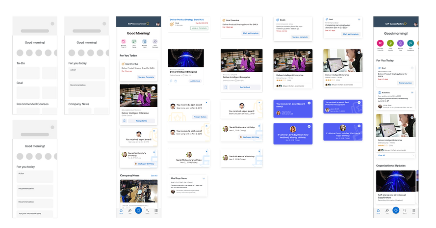
By examining each user flow and see how the homepage could fill in the gap, we consolidated on a concept of "engagement card". Each card highlights an event, a to-do, or an opportunity that is most relevant to the users.

Another aspect we noticed from the user flow exercise is that the navigation path to get to a frequently used functionality was difficult. Those functions are typically embedded in a module product page with several clicks away, which requires discoverability.
To tie back to users' needs and the supportive bucket of the new homepage experience, I see the design opportunity of a mini-app experience to make recurring and frequent activities happen right from the homepage.

3. Deciding on the information layout of the homepage
To identify the info structure for the homepage and the details of quick action and engagement cards set up, we went through a couple of iterations. We evaluate each option and variation based on the scalability and growth pattern. We landed on a decision of the following order:
Quick actions
They are represented as the colorful round tiles at the top of the homepage. A simple tap on the tile will trigger the mini-app experience.
For You Today
This section has the engagement cards set ranked in order of action, recommendation, information.
Organizational Updates
These cards will still be leveraging the engagement card framework with the ability to allow customer admins to configure their company-specific contents. Being able to have company-specific info shown on the homepage is a repeating business requirement we receive from customer engagement sessions.
4. Further design iteration on engagement cards
To make the card scalable, I come up with different card variations and improve them with feedback from module PM, users, designers, and engineers.


Those refined cards are created and optimized as reusable components for designers to quickly add onto their canvas and plug in the values that are suitable for the use cases. Each card would then become the building block for employee's individualized experience.


5. Add delightful motion touches
MOTION TOUCH 1
Header transition
Customers can upload their company logos and change a cover image in the new homepage experience. To optimize this experience further, I added a motion transition in the header.
MOTION TOUCH 2
Completing a goal
Users get to experience the completion motion when they complete or act on a card. I incorporate the Fiori moments illustration, which is part of SAP's Fiori design system asset, into the design.
MOTION TOUCH 3
Shimmering effect
Users always appreciate a smooth and hopefully enjoyable loading experience. In this project, I explored adding skeleton state while the app is waiting for the API call.
The imapct
"Let me just start by saying WOW! The fresh, appealing homepage makes me want to explore."
- SuccessFactors 500 Fortune Customers

The new experience is launched in May, 2021. More than 1000+ customers opted in for the preview experience.
Launched!

Available around the globe
40 companies from 18 countries signed up for the early adopter program.
Reflection
Complexity doesn't always come from design itself.
The complexity of this project is at alignment and overall design thinking to create patterns that incorporate all possible user flows. I get to know all the modules and their key use cases, different users, and how those users use SuccessFactors. I learned about HR solution's capabilities and also stakeholder management skills.
Beyond that, designing a really easy-to-use component is also a "gift" for designers who consume your component. It saves their time and helps them become more productive at work, which is also meaningful in the essence of HXM.
There's never over communication!
One big thing I learned from this project is to get involved in the discussions with engineers to think about different scenarios and edge cases and how we address them in design to ensure a good user experience. To make a product usable, UX need ot not only think about key flows and beautiful visuals, but also all the possible events that a user might encounter - which matters a lot to a good product experience. For example, how the loading experience will be? How a page gets refreshed? How does an error state look? Designers need to have this WIP and inclusive mindset to achieve a beautiful yet usable product.

